

2–4 Color Palettes for Group T Shirt Photos Photographers Recommend
Photographers agree on this: mid-tone colors, moderate saturation, and solid fabric win every time. Stick to navy, charcoal, forest or olive green, rust, camel, dusty blue, or burgundy, then check two things before anyone clicks the shutter. Does the shade match your skin’s undertone, and does it stand apart from the background instead of blending into it?
TL;DR:
- Mid-tone colors like navy, charcoal, rust, and dusty blue are safest choices as they preserve fabric detail and avoid sensor blowout or shadow loss.
- The best T-shirt colors depend on matching your skin’s undertone, with warm tones pairing with shades like rust and olive, and cool tones with navy and jewel colors.
- Avoid pure white, black, neon brights, micro-patterns, and busy graphics, as these can cause technical issues or distract from your face on camera.
- Coordinating group outfits should stick to 2 to 4 harmonious shades plus one neutral and contrast with backgrounds to prevent blending.
- Testing shirt colors under shoot lighting and with actual props minimizes surprises and ensures your outfit enhances rather than detracts from your photos.
Table of Contents
- Best T-Shirt Colors for Photos and Why They Work on Camera
- How Do You Match T-Shirt Color to Your Skin Undertone?
- What Colors Should You Avoid Wearing in Photos?
- Coordinating T-Shirt Colors for Group and Family Photos
- Fabric, Texture, and Fit That Photograph Well
- How to Test a T-Shirt Before Your Shoot
- Shopping and Styling Tips for Photo-Ready T-Shirts
- The Impact of Shirt Color on Mood and Message in Photos
- Choosing T-Shirt Colors for Different Photo Types
- How to Coordinate T-Shirt Colors With Props and Environment
- Considerations for Color Vision Deficiencies in Photos
- How Camera Sensors and Editing Affect Shirt Color
- Why Event Tees Need the Same Photo Rules as Portrait Wardrobes
- Where to Find Photo-Ready T-Shirts for Your Next Group Event
- Sources
- FAQ
Best T-Shirt Colors for Photos and Why They Work on Camera
Camera sensors have a limited dynamic range, meaning they can only capture so much detail between the brightest highlight and darkest shadow in one frame. Push a color to either extreme and the sensor has to choose: either it blows out the highlights or it swallows the shadows. Mid-tones sit in that comfortable middle zone, so the fabric keeps its texture and the viewer’s eye stays on your face instead of your shirt, according to Snappr’s outfit guide.
These are the shades that show up again and again in photographer recommendations, and where each one earns its place:
- Navy — reads as polished without looking like a uniform; strong for headshots and studio work.
- Charcoal — a softer stand-in for black that still holds detail in bright light.
- Forest or olive green — blends naturally into outdoor settings, especially wooded or grassy backdrops.
- Rust — warms up fall fields and golden-hour light better than almost any other shade.
- Camel — a warm neutral that photographs well against both indoor and outdoor backgrounds.
- Dusty blue — softer than true blue, flattering under overcast or diffused light.
- Burgundy — adds depth for editorial or dressier casual shoots without overpowering the frame.
A warm mid-tone often works as a dependable default for portrait sessions since it adds subtle warmth without clashing with varied skin tones, per Chasing Stone’s guide to skin tone and backdrop color. If you only own one “safe” shirt for photos, make it one of these.
How Do You Match T-Shirt Color to Your Skin Undertone?
Your undertone determines whether a color makes your skin look brighter or grayer on camera, and it has nothing to do with how light or dark your skin is. Warm undertones lean toward gold, peach, or yellow beneath the surface. Cool undertones lean pink, red, or blue. Neutral undertones sit right in between and can borrow from both families.
Three quick checks tell you which one you have:
- The vein test. Check the veins on your inner wrist in natural light. Green veins suggest warm undertones; blue or purple veins suggest cool; a mix of both suggests neutral.
- The jewelry test. Gold jewelry that makes your skin glow points to warm undertones. Silver that looks better points to cool.
- The fabric test. Hold a warm-toned fabric and a cool-toned fabric under your chin in a mirror and watch which one makes your face look brighter rather than washed out.
Warm undertones generally pair well with cream, camel, olive, rust, and mustard. Cool undertones pair with white, gray, navy, true blue, and jewel tones. Neutral undertones can wear both columns without much trouble, according to Kristin Cruz’s guide on choosing photoshoot colors.
Pro Tip: Skip the guesswork and do the real test: hold each candidate shirt up next to your face in the actual light you’ll be shooting in, then pick whichever one brightens your complexion instead of draining it.

What Colors Should You Avoid Wearing in Photos?
Pure white and pure black are the two most common mistakes, and both come down to how a camera sensor handles light. White reflects so much light that in bright sun it can lose all fabric detail and blow out into a flat, textureless blob. Black absorbs light aggressively, which crushes shadow detail and can turn a shirt into a shapeless silhouette. Off-white, cream, oatmeal, deep charcoal, and navy solve both problems while keeping the same general look, based on Adobe’s guide to white balance.
A few other categories to skip:
- Neon and highly saturated brights — these cast their own color onto your skin (a phenomenon photographers call color spill) and pull focus away from your face.
- Micro-patterns like tight stripes, houndstooth, or fine checks — these can trigger moiré, a wavy or shimmering distortion that happens when a pattern’s fine detail conflicts with the camera sensor’s pixel grid, explained in Adobe’s breakdown of aliasing and anti-aliasing.
- Large logos or busy graphics — they compete with your face for attention in every single frame.
Coordinating T-Shirt Colors for Group and Family Photos
Coordinated does not mean identical. The strongest group photos come from a shared palette, not matching uniforms, according to Snappr’s outfit-planning guide. Here’s a simple system that works for any group size:
- Pick 2 to 4 harmonious colors, plus one neutral. Something like navy, burgundy, camel, and cream gives everyone options without forcing exact matches.
- Vary the tones and textures within that palette. One person in a solid navy tee, another in a lighter dusty blue, a third in a textured knit in the same family.
- Assign the “pop” color carefully. Give the brightest or most saturated shade to one or two people at most, not the whole group, and put the neutral on whoever wants to blend in.
- Check the actual background before locking anything in. A palette that looks great on paper can vanish into a green lawn or clash with a red-brick wall.
For bachelorette weekends or girls’ trips, this same approach works better than handing everyone the exact same shirt. A group outfit coordination guide walks through how to build a palette that still reads as a group without looking like a school uniform.
Fabric, Texture, and Fit That Photograph Well
Flat, thin cotton can look lifeless under studio or outdoor light, while a shirt with subtle texture, like a slub knit or a slightly heavier cotton, adds visible depth without needing any editing help. That texture catches light in small variations across the fabric, which reads as richness on camera instead of a flat block of color.
Fit matters just as much as fabric:
- Avoid shirts that are too tight, since they can pull and bunch in ways that show up clearly in still photos.
- Avoid shirts that are too baggy, since fabric can pool or hide your shape in a way that reads sloppy.
- Choose necklines that frame your face rather than competing with it, like a relaxed crew or a soft V.
- Skip shiny synthetics, which reflect light unpredictably, and heavy printed logos, which crease visibly and distract from the shot.
A top designed for everyday wear is a good example of the kind of versatile, well-draping garment that holds its shape through a shoot instead of fighting the camera.
Pro Tip: Run your hand across the fabric before you buy. If it feels papery-thin under your fingers, it will likely look flat and lifeless in photos too.
How to Test a T-Shirt Before Your Shoot
Never trust how a shirt looks in a store dressing room. Store lighting is almost never the lighting you’ll actually shoot in, and color casts from fluorescent bulbs or tinted windows can completely change how a shade reads.
Run through this checklist the day before or the morning of your shoot:
- Do a phone test in the real location. Snap a photo in the actual light and background you’ll be using, then check for color casts, flattened texture, or any hint of moiré in the fabric.
- Hold the shirt near your face and see whether it brightens your complexion or grays it out, the same test recommended for undertone matching.
- Bring a backup mid-tone shirt and one layering piece, since even a good plan can fall apart if the light shifts or the background changes.
- Take a real test shot on the actual camera or phone you’ll use, and review it at full size, not just on a tiny thumbnail.
- Pack a lint roller and hang the shirt the night before to cut down on visible wrinkles.
Testing garments under your actual shooting light matters because auto white balance and mixed light sources can shift color in ways you would never predict standing in your closet, per Adobe’s white balance guidance.
Shopping and Styling Tips for Photo-Ready T-Shirts
Product listings love vague, pretty-sounding color names, and that’s exactly where shoppers get tripped up. “Blush,” “sage,” and “dusty rose” usually mean muted, toned-down versions of pink, green, and rose, which is precisely the mid-saturation range that photographs best. Words like “neon,” “electric,” or “vibrant” are a signal to scroll past if you’re shopping for photos.
A few more shopping and styling notes:
- Choose a heavier knit or textured weave over thin jersey when you want visible drape and dimension.
- If you’re packing for a destination shoot, roll rather than fold to cut down on deep creases, and hang the shirt as soon as you arrive.
- Layer a light cardigan or button-up over your tee for outdoor or transitional shoots. It adds visual interest without adding a second competing color.
- Keep jewelry minimal. A single simple piece will not distract from your shirt color the way a stack of bracelets or a chunky necklace can.
A style guide for graphic tees covers additional layering and neckline options if you’re working with a printed design rather than a plain color.
The Impact of Shirt Color on Mood and Message in Photos
Color communicates before a single word does. A navy or charcoal tee reads as calm, grounded, and a little formal, which is why it shows up so often in professional headshots. Rust, camel, and burgundy carry warmth and approachability, useful for lifestyle or family photos where you want to look inviting rather than buttoned-up. Dusty blue and sage suggest softness and calm, common choices for maternity or reflective portrait sessions.
Brighter, more saturated colors send a louder message: energy, celebration, playfulness. That’s exactly why a group of friends celebrating a birthday or bachelorette weekend might lean into a bold color as the shared theme, while a formal family portrait sticks to muted, coordinated neutrals. The mood you want the photo to carry should drive the color choice, not the other way around.
This matters just as much for solo portraits as for groups. A job-search headshot in deep charcoal signals competence and seriousness. The same person in a soft dusty blue for a casual outdoor session signals approachability instead. Neither shade is wrong, but they send different messages, and mismatching the color to the occasion is one of the more common styling mistakes people make without realizing it. Think about what you want the photo to say about the moment before you open your closet.
Choosing T-Shirt Colors for Different Photo Types
Portraits, outdoor sessions, studio shoots, and casual snapshots each put different demands on color, mostly because of how light behaves in each setting.

Portraits and headshots benefit most from navy, charcoal, or a warm mid-tone, since these hold detail well against both plain and blurred backgrounds and keep full attention on the face.
Outdoor sessions do best with colors that either complement or gently contrast the environment. Forest green and olive can blend a little too well into wooded settings, so consider rust, camel, or dusty blue instead if you want to stand out against greenery rather than disappear into it.
Studio shoots with controlled lighting give you the most flexibility, since you’re not fighting shifting natural light. This is where richer jewel tones like burgundy or deep emerald can shine, since studio lights render color more predictably than sunlight does.
Casual, everyday-style shoots tend to favor softer, more relaxed shades: dusty blue, camel, or muted sage. These feel less “dressed up” than deep jewel tones and photograph naturally without looking overly composed.
For formal versus casual, the same mid-tone logic applies but with a shift in saturation. A slightly richer, deeper version of a color (deep burgundy over bright red, charcoal over light gray) tends to read as more formal, while a softer, lighter version of the same family reads as relaxed.
How to Coordinate T-Shirt Colors With Props and Environment
A shirt color that looks great on its own can clash badly the moment you add props or step into a specific setting. Check what’s actually in the frame before finalizing your outfit, not after.
If your shoot includes props like flowers, balloons, drinks, or signage, pull your shirt color from the same family instead of competing with it. A rust or camel tee pairs naturally with fall foliage or wooden props. A dusty blue or navy tee complements ocean, sky, or water-adjacent backdrops. Muted burgundy works well against string lights, wine glasses, or warm indoor settings, which makes it a natural fit for celebration-themed shoots.
The environment itself works the same way. A busy, colorful background (a mural, a crowded street, a patterned wall) calls for a simpler, more solid mid-tone shirt to avoid visual competition. A plain, neutral background (a beige wall, an open field, a clear sky) gives you more room to introduce a bolder or richer color since there’s nothing else pulling focus.
The golden rule is contrast, not matching. If your shirt color is too close to the background color, you risk blending in and losing definition in the photo. A quick way to check: squint at the scene, or check it in black and white on your phone. If the shirt and background turn into a similar shade of gray, they’re too close in tone even if the colors look different to the naked eye.
Considerations for Color Vision Deficiencies in Photos
Color vision deficiency, often called color blindness, affects a meaningful share of people, primarily men, and mostly involves difficulty distinguishing red from green or, less commonly, blue from yellow. If you or someone you’re photographing has a color vision deficiency, a few adjustments make outfit planning easier and reduce the risk of an unintended clash.
Lean on brightness and contrast rather than color alone when picking a palette. Someone with red-green color vision deficiency may struggle to tell a muted olive from a muted rust, even though a camera captures them as distinctly different colors. Asking a friend, family member, or the photographer to confirm the color name on the tag, rather than relying on visual judgment alone, avoids an awkward surprise once the photos are edited.
This also matters for anyone building a coordinated group outfit where one or more participants have a color vision deficiency. Rather than describing colors verbally (“wear something in sage green”), it helps to hold up an actual sample garment or swatch so everyone can compare directly, since verbal color descriptions can mean different things to different people even without a vision deficiency involved. Sticking to high-contrast combinations, like a deep charcoal paired with a warm camel, tends to be easier for everyone to coordinate correctly regardless of how each person perceives color.
How Camera Sensors and Editing Affect Shirt Color
Every digital camera sensor interprets color through tiny red, green, and blue filtered pixels, then reconstructs a full-color image through a process called demosaicing. Extremely fine patterns or textures can interfere with that reconstruction, producing moiré, an unwanted wavy or rainbow-like distortion that shows up even on high-resolution cameras, according to Adobe’s explanation of aliasing and anti-aliasing. This is the technical reason solids and larger, simpler patterns are safer bets than tight stripes or fine checks.
White balance adds another layer. The same navy shirt can look slightly blue, slightly purple, or slightly gray depending on whether the camera is set to daylight, tungsten, or auto white balance, and depending on what light sources are actually present in the room or scene. That’s why white balance is not just a garment property; it’s a relationship between the fabric color and the lighting condition at the moment of capture, per Adobe’s white balance guide.
In post-processing, mid-tone colors give an editor the most room to work. Extremely bright or extremely dark shirts have less recoverable detail if the color needs adjusting, since the underlying pixel data was already pushed to one extreme during capture. A mid-tone rust or dusty blue shirt has believable, adjustable color data available across the whole tonal range, which is part of why editors and photographers keep steering people back toward the same family of shades.
Why Event Tees Need the Same Photo Rules as Portrait Wardrobes
Group event shirts get photographed constantly, at brunch, on a bachelorette weekend, during a girls’ trip, and the same mid-tone rules apply just as much to a themed tee as to a studio portrait outfit. A subtle textured fabric in a muted shade holds up across a dozen phone cameras and lighting conditions in a way a stark white or neon shirt never will.
The real challenge with event tees is balancing a fun graphic with a photo-friendly base color. A loud design can still work if the shirt underneath sits in that reliable mid-tone range. Designing shirts that need to photograph well in group chats and Instagram grids, not just look good on a hanger, has shaped how these color choices actually hold up in the real world.
— Stephen
Where to Find Photo-Ready T-Shirts for Your Next Group Event
Matching event tees that photograph well without washing out or clashing in group shots can be hard to find. Every collection sticks to the same mid-tone, texture-forward thinking covered above, so you’re not stuck choosing between a fun design and a shirt that looks good on camera.
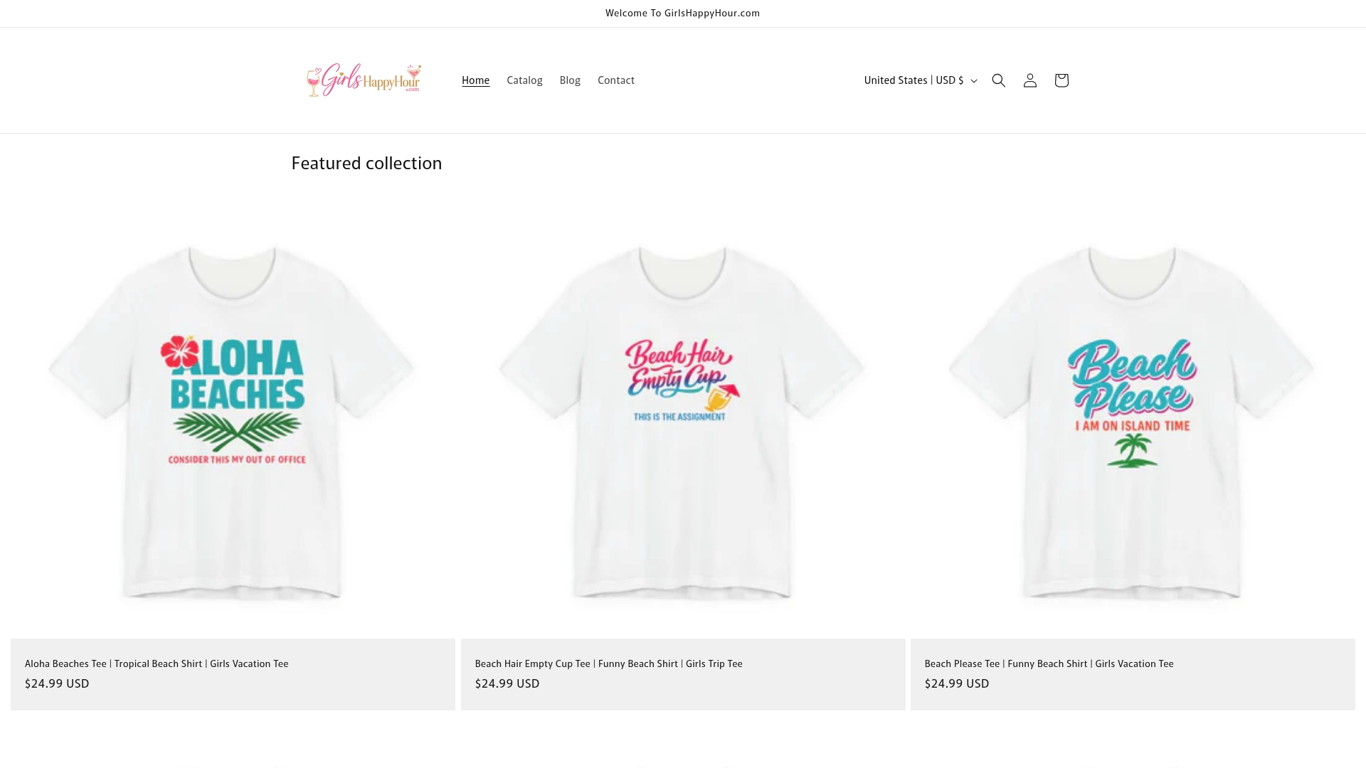
Start with the Girls Night Out Tees collection if you’re planning a night out with a mid-tone base and a graphic that pops without overwhelming the frame. Heading somewhere with a group? The Matching Girls Trip Shirts collection leans into the coordinated-not-identical palette approach this guide walks through, letting each person’s shade sit in the same family without looking like a uniform. For a bachelorette weekend, the Bachelorette Party Shirts collection sticks to the same muted, camera-tested color logic.
When you’re browsing, apply the same test from this guide: hold the color swatch or product photo up mentally against your planned setting, and pick shades that will contrast with your background rather than disappear into it. Head to the collections above and start building your group’s palette now.
Sources
- How to Pick Outfits for Photoshoots: The 2026 Guide
- What’s your undertone? The key to choosing the right colors for photoshoots
- Adjusting white balance settings to improve photos.
- Skin tone and backdrop color: a photographer’s guide to flattering every client
FAQ
What Is the Best Shirt Color to Wear in Pictures?
There is no single universal best color, but mid-tones like navy, charcoal, rust, camel, and dusty blue photograph most reliably because they preserve fabric detail and complement most undertones, according to Snappr’s outfit guide. The right choice still depends on your undertone and the background you’ll be shooting against.
What Is the 3-3-3 Rule for Clothes?
The 3-3-3 rule is a general packing and styling method, not a color-specific rule for photos, and its exact definition varies depending on the source, so no single canonical version applies here. For photo-ready outfits, the more relevant guidance is choosing 2 to 4 coordinated colors plus one neutral, as covered in the group coordination section above.
What Colors Should You Avoid Wearing in Photos?
Pure white and pure black are the biggest risks, since they can blow out highlights or crush shadow detail depending on the light. Neon brights and micro-patterns like fine stripes or checks are also risky, since brights cast color onto skin and tight patterns can trigger moiré distortion, per Adobe’s anti-aliasing guide.
What Are Some Good Colors for T-Shirts in Photos?
Navy, charcoal, forest or olive green, rust, camel, dusty blue, and burgundy consistently perform well across portrait, outdoor, and group settings. Girlshappyhour’s Girls Night Out Tees and Wine & Drinking Tees collections both lean into these same photo-tested mid-tone shades for group events.
How Do I Know if a T-Shirt Color Will Wash Me Out?
Hold the shirt near your face in the actual lighting you’ll be shooting in and watch whether your complexion looks brighter or grayer, the same test recommended for undertone matching. If the color pulls attention to shadows or dullness under your eyes rather than lighting up your skin, it’s the wrong shade for that shoot.